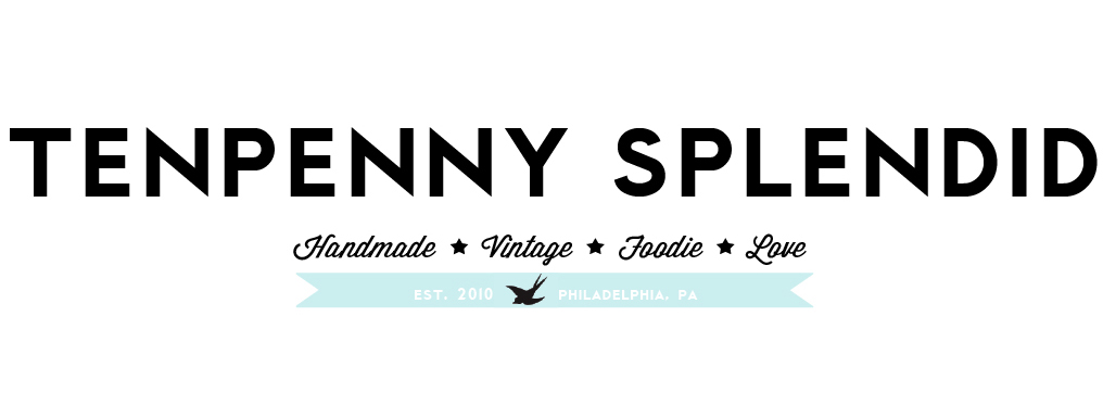


I've been working like crazy on the branding for tenpenny splendid so I'll be all ready to go when the shop is up and running. Here's just a sneak preview of what's going on in the identity package so far.
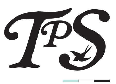
You may have already noticed this logo down to the left in my shop ad. For this package I have created a logo, a monogram (above), and an icon (the sparrow in the monogram). I wanted these three different elements so I could do different things with them. The monogram and sparrow icon work well at any scale since they are simple and graphic. The seal can't get too small because of all the information in it.
I'll share all of that soon. I'm just messing around with everything on different pieces such as a business card, thank you note, envelope, hang tag, etc.
I'll also show you all of the inspiration images I used to get my ideas flowing. I had a very specific look in mind and used some visual inspiration for guidance. I'll post the basic design process that went into it.
Above you'll also see my primary color palette. I have a secondary one in the works too that features a few of my favorite colors that pop up around the blog.
I'd love any feedback if you have thoughts or opinions. I'll be revealing the whole thing soon enough. Sometimes I miss art school at times like these. As much as it was kind of horrible, those six hour critiques could be really helpful. Oh no, you didn't read that wrong.. six.. hours.
Yea. Do I really miss that?
Well happy snow day for a good part of the country! Hot chocolate time.
:)
No comments:
Post a Comment
Thanks for stopping by! I always love to hear what you have to say so feel free to add your thoughts!